 Best
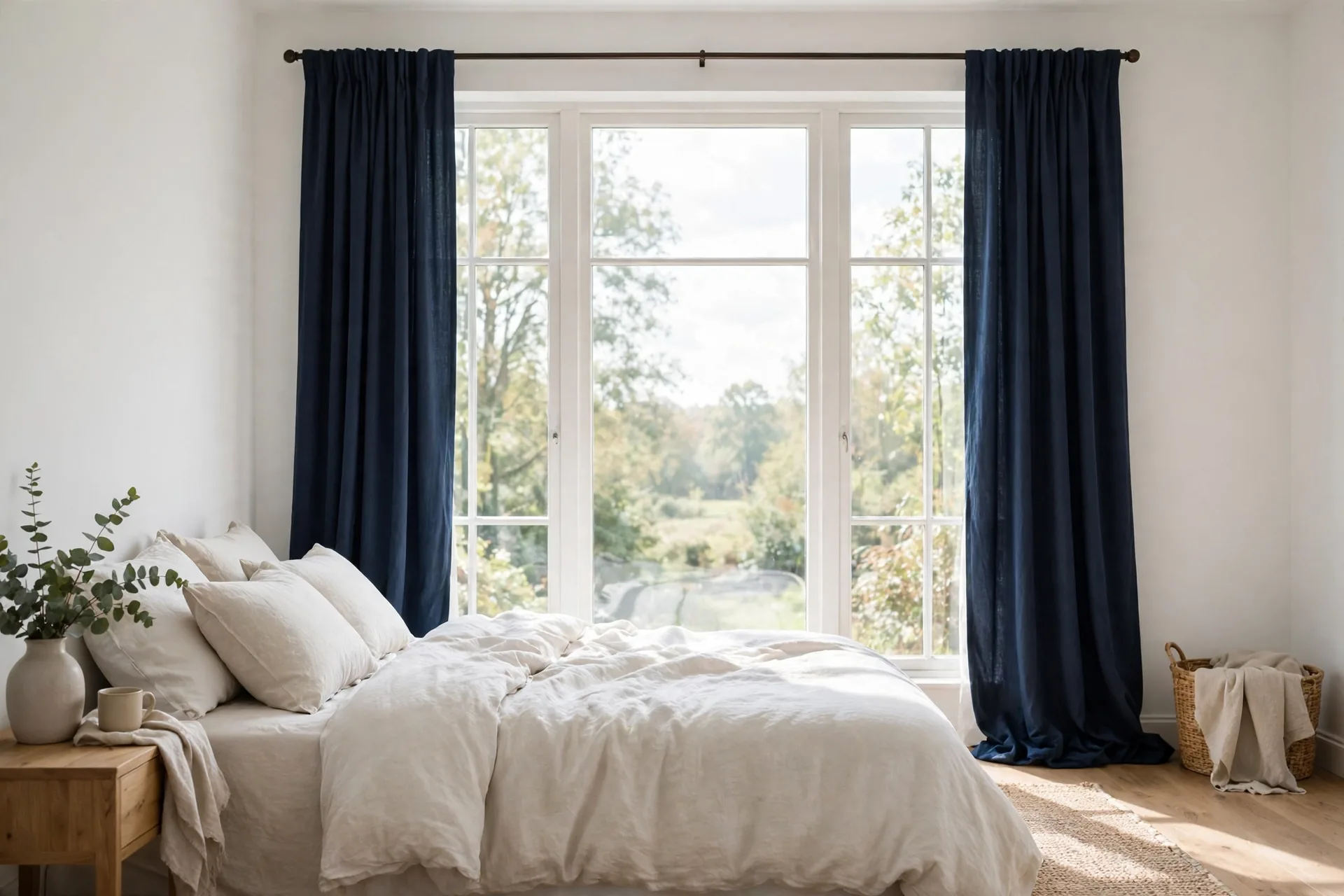
Best Blue Curtains
Blue curtains range from pale sky to deep navy, and the shade changes the room more than the fabric does. This guide tells the four blues apart, then pairs each with walls, sofas, and light levels.
Blue curtains cover more ground than any other color family. Navy is formal and deep, dusty blue is muted and calm, light blue is airy and bright, and royal blue is bold and saturated, and each one changes a room in a different direction. This guide tells the four blues apart first, then pairs each shade with walls, sofas, and light levels, so the blue you buy is the blue your room actually needs.
Blue curtains by job: the shortlist
The six picks below cover the jobs blue does most often: dark sleep in navy, calm living in dusty blue, soft daylight in light blue, bold accent in royal blue, gentle darkness for a child's room, and depth for a formal room. Each pick names its shade, its lining, and the job it suits, because with blue, the shade and the lining together decide the result.
As an Amazon Associate, we earn from qualifying purchases.
| Pick | Type | Lining | Best for |
|---|---|---|---|
| 1 | Navy blackout panels | Blackout lining | A bedroom that needs the darkest blue sleep |
| 2 | Dusty blue linen-look panels | Unlined | A calm living room with a muted blue |
| 3 | Light blue semi-sheer panels | Unlined | A bright room that wants a soft blue glow by day |
| 4 | Royal blue blackout panels | Blackout lining | A living room that wants a bold blue accent |
| 5 | Sky blue blackout panels | Blackout lining | A nursery or child's room that needs darkness with a light color |
| 6 | Navy velvet panels | Unlined | A formal room or media room that wants depth and glare control |
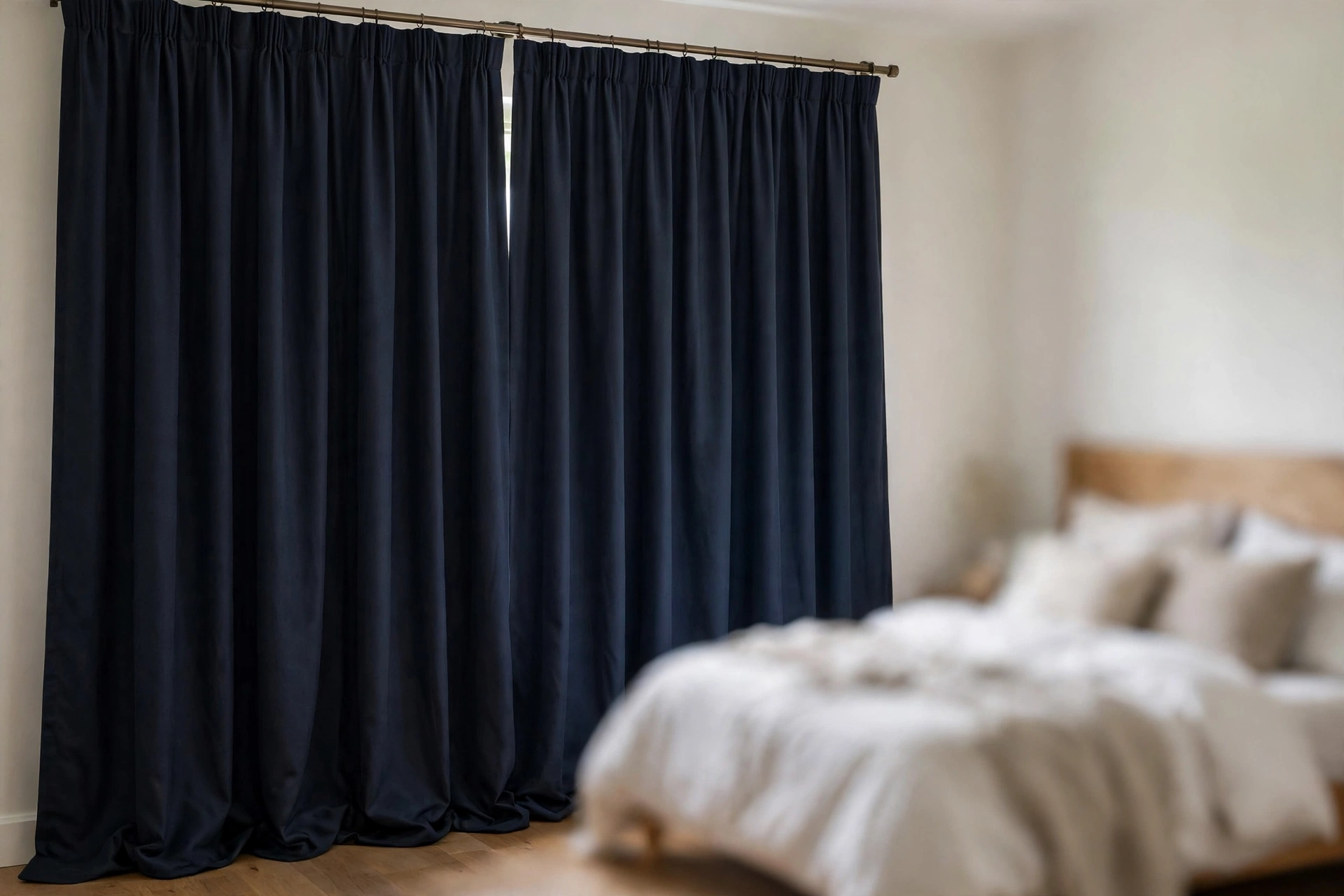
1. Navy blackout panels: best for a bedroom that needs the darkest blue sleep
- Best for: A bedroom with street light outside, where navy must give darkness and formality together.
- Key features: Navy face, blackout lining, darkest result in this shortlist, sold as a pair.
- Pros: Deep navy gives darkness and formality together, blackout lining blocks street light, navy suits white and cream walls.
- Cons: Navy can darken a small room, navy shows lint, check the listing for the exact light-blocking claim before ordering.
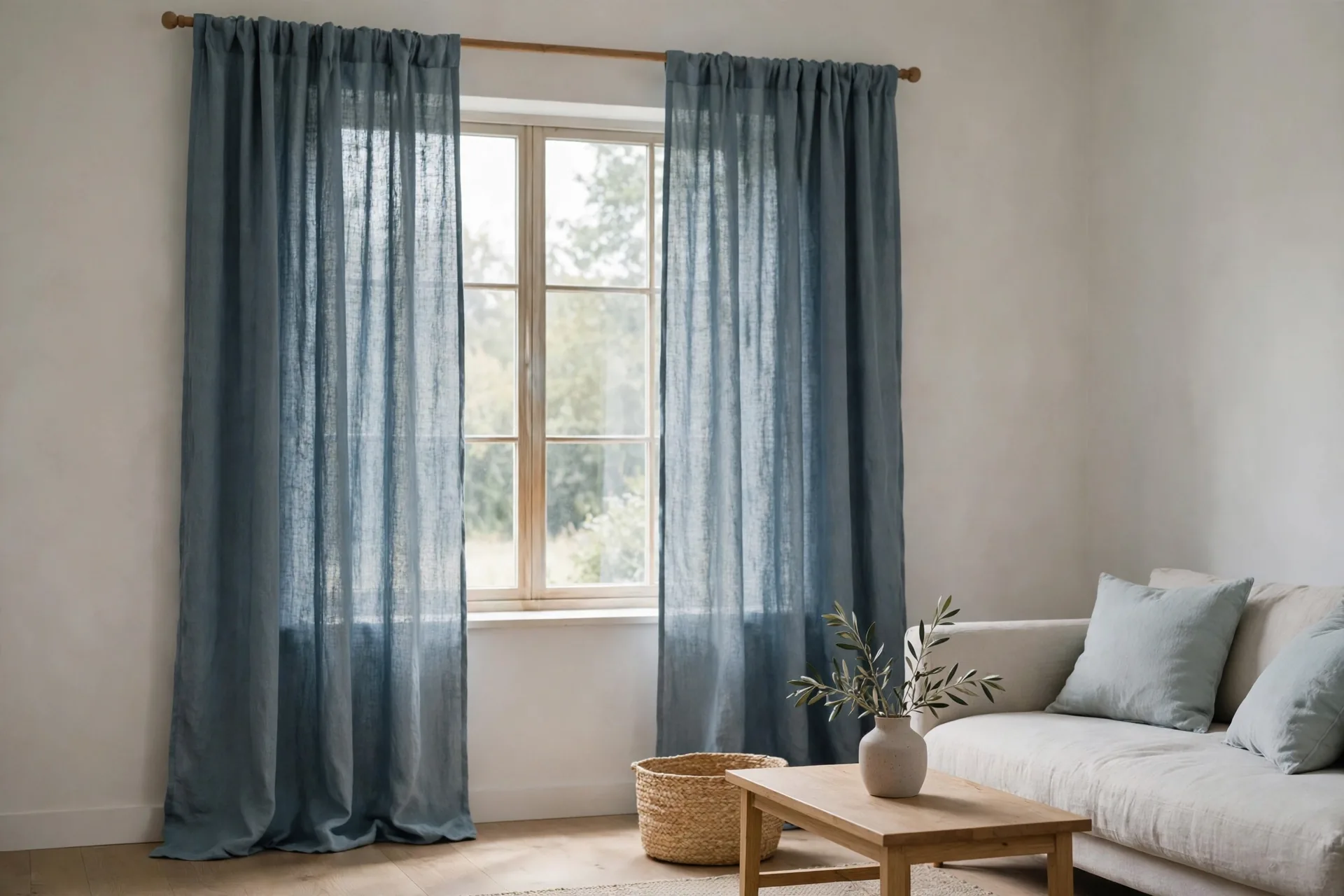
2. Dusty blue linen-look panels: best for a calm living room with a muted blue
- Best for: A calm living room with gray or beige sofas, where daytime privacy is enough and the tone must stay muted.
- Key features: Dusty blue linen-look fabric, unlined, visible slub texture, muted tone.
- Pros: Muted tone calms a busy room, texture adds interest without a print, dusty blue suits gray and beige sofas.
- Cons: Unlined panels give daytime privacy only, dusty blue can look gray in dim light, linen-look fabric wrinkles after washing.
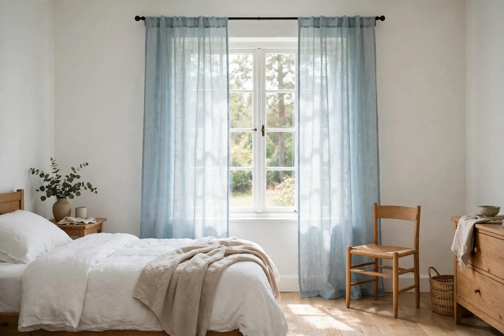
3. Light blue semi-sheer panels: best for a bright room that wants a soft blue glow by day
- Best for: A bright room with white or pale walls that wants a soft blue glow by day, layered for evening privacy.
- Key features: Light blue semi-sheer linen-blend fabric (30% linen, 70% polyester), back tab and rod pocket hang, soft light-filtering, light drape.
- Pros: Soft blue glow by day, keeps a bright room bright, light blue suits white and pale walls.
- Cons: No privacy at night with lights on, light blue semi-sheer can look washed out in strong sun, layer with a heavier panel for evening privacy.
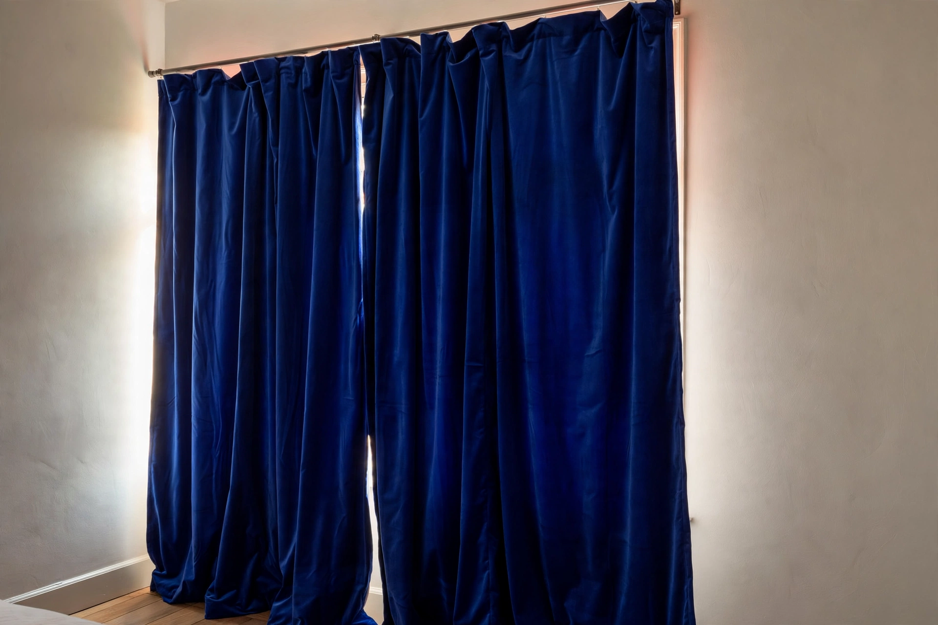
4. Royal blue blackout panels: best for a living room that wants a bold blue accent
- Best for: A neutral living room large enough to carry a saturated accent, where full darkness is welcome.
- Key features: Royal blue face, blackout lining with a sewn-in black liner, thermal insulation, saturated color, 2 panels with grommet hang.
- Pros: Bold accent without a print, blackout lining gives full darkness and noise reduction, royal blue anchors a neutral room.
- Cons: Saturated color dominates a small room, royal blue can clash with warm wood, blackout darkens more than room-darkening would.
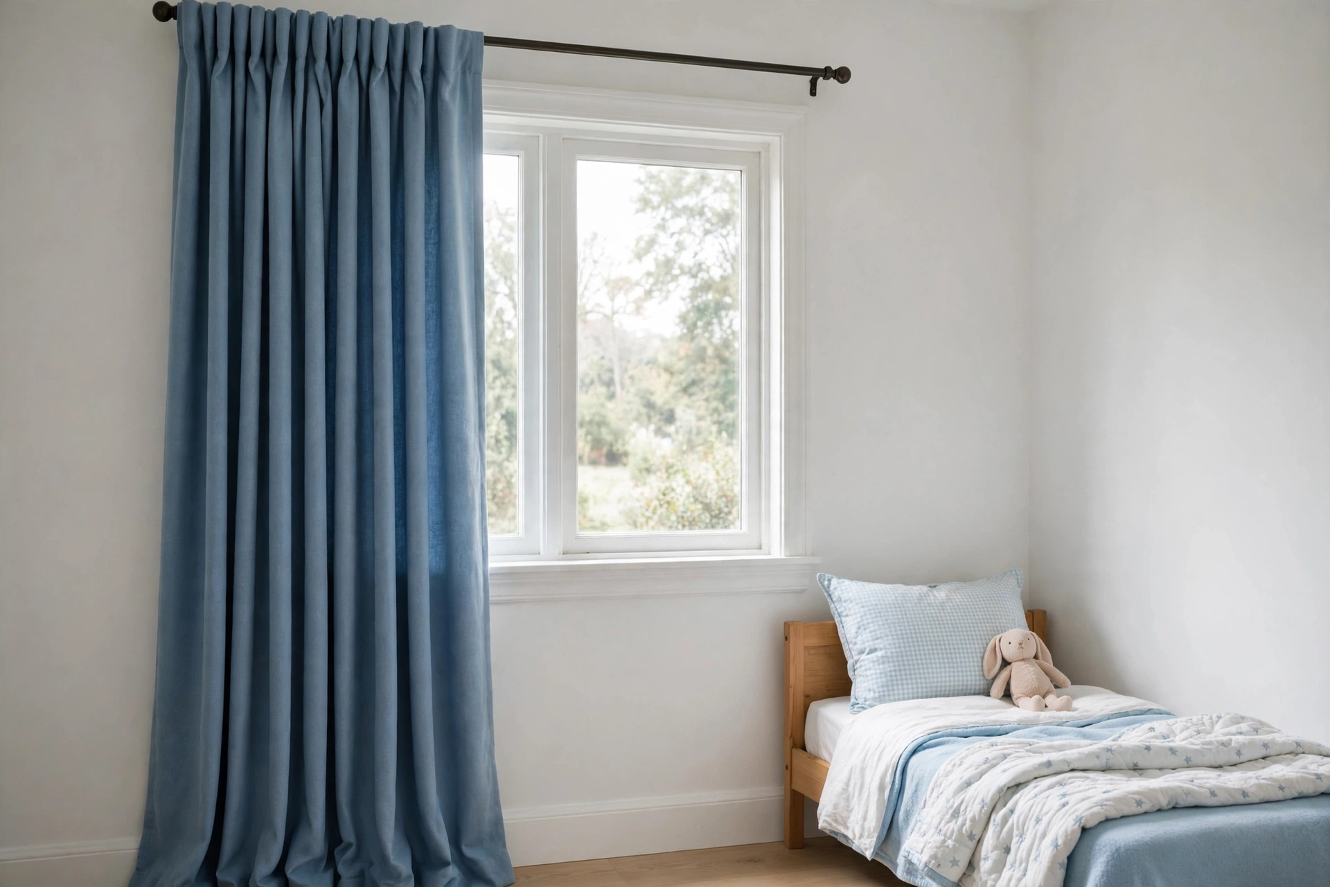
5. Sky blue blackout panels: best for a nursery or child's room that needs darkness with a light color
- Best for: A nursery or child's room with white furniture, where the face must stay light and cheerful by day and dark at nap time.
- Key features: Sky blue face, blackout lining, light face with a dark result, sold as a pair.
- Pros: Light color keeps the room cheerful by day, blackout lining gives darkness for naps, sky blue suits white furniture.
- Cons: Light face shows marks sooner than navy, sky blue can look cold against warm wood, check the listing for the exact light-blocking claim before ordering.
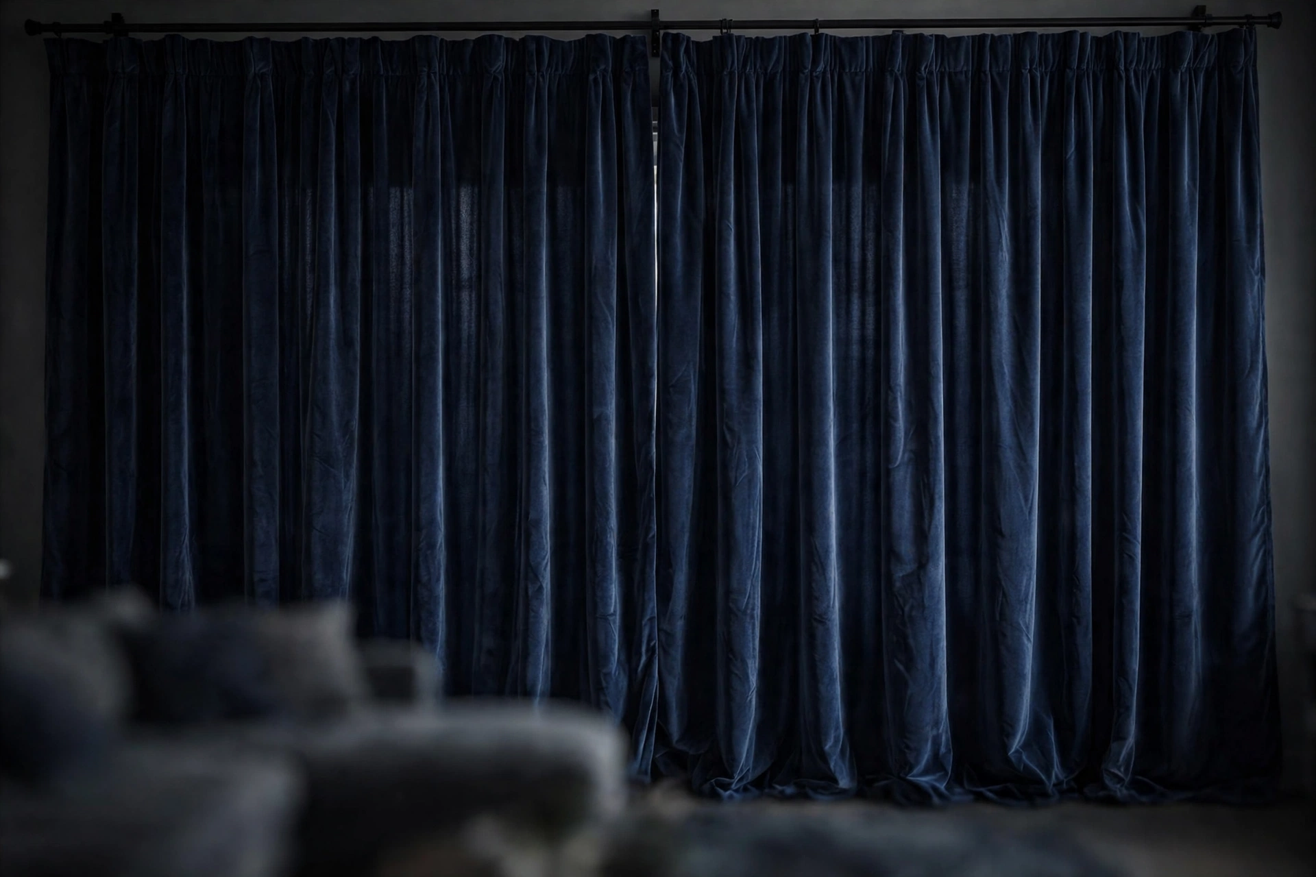
6. Navy velvet panels: best for a formal room or media room that wants depth and glare control
- Best for: A formal or media room where depth and glare control matter and room-darkening is enough, not a small or dim room.
- Key features: Navy velvet, unlined, heavy drape, soft pile.
- Pros: Depth and formality no flat fabric can match, pile softens sound in a media room, navy velvet suits brass and dark wood.
- Cons: Heavy fabric needs a strong rod, navy velvet shows lint and pet hair, unlined velvet is room-darkening, not blackout, not a good choice for a small or dim room.
Navy, dusty, light, and royal: telling the four blues apart
Start by naming the blue you actually want, because the four main blues behave like four different colors. Navy is the deepest blue: formal, grounding, and close to black in a dim room. It anchors a room, frames a view, and suits a bedroom or a formal living room. Dusty blue is navy softened with gray: muted, calm, and easy to live with. It suits a living room or a bedroom where the blue should be felt rather than noticed. Light blue, including sky blue, is the airiest blue: bright, open, and cheerful. It suits a small room, a child's room, or any room that needs light. Royal blue is the boldest blue: saturated, vivid, and attention-seeking. It suits a single accent window in a neutral room, and it overwhelms a room when used everywhere.
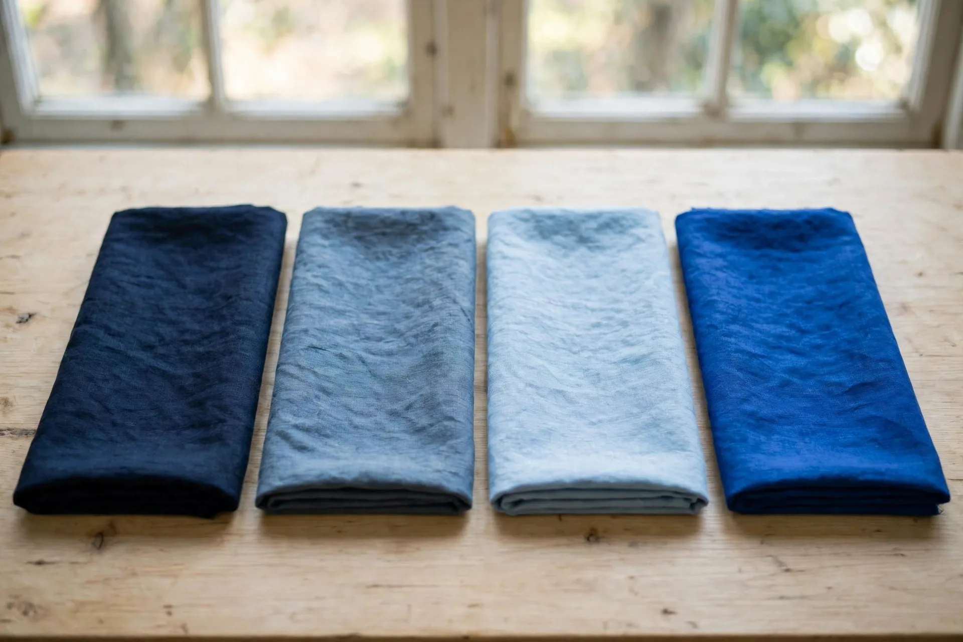
Depth changes the room as much as the shade does. A navy panel absorbs light and adds weight, so it needs a room with daylight and light walls to balance it. A light blue panel reflects light and adds air, so it suits a small or dim room that navy would shrink. Dusty blue sits in the middle: it adds color without adding weight, which makes it the safest blue for a room you are unsure about. Royal blue adds energy, which suits a living room that feels flat, and suits nothing that already feels busy.
The fastest way to tell the blues apart at home is the daylight test. Hold the fabric against the wall in morning light and again in evening light, because blue shifts with the light more than most colors. Navy can look black in dim light, dusty blue can look gray, light blue can look washed out in strong sun, and royal blue can look louder under warm lamps. A sample in your own room, at two times of day, settles the shade faster than any name on a listing.
Turquoise is a fifth blue worth recognizing, because it is a bright blue-green, distinct from the teal edge covered in the undertone section. It needs cool walls to sit well, reads loud in a small room, and fades fast in sun, so it suits a single bright accent window better than a whole room of blue.
Blue by undertone: cool blues, warm blues, and teal edges
Most blues are cool, but not all of them, and the undertone decides what the blue pairs with. A cool blue leans toward violet or pure blue, and it suits white, gray, and silver elements. A warm blue leans toward teal or green, and it suits cream, beige, and warm wood. A teal-edged blue sits between blue and green, and it needs the same care as any in-between color: check it against the room's warm and cool elements before committing, because it can read blue in one light and green in another.
The undertone test is the same as for any color: hold the fabric against the wall, the sofa, and the floor, and watch which direction it pulls. If the blue and the wall share the same cool direction, they look settled together. If a teal-edged blue sits against a cool gray wall, the green in it can look like a mismatch. If a warm blue sits against a warm cream wall, the pair looks intentional. When the room already mixes warm and cool elements, dusty blue is the safest bridge, because its gray content softens the undertone in both directions.
One undertone trap is the exact-match trap. A blue curtain in exactly the same shade as a blue wall or a blue sofa looks flat, because nothing separates the two surfaces. Move the curtain at least one clear step lighter or darker than the wall or the sofa, and the window gains a frame. A navy curtain against a light blue wall, or a light blue curtain against a navy sofa, reads as a deliberate pairing, while an exact match reads as an accident.
Blue curtains with white, cream, and gray walls
White walls are blue's easiest partner. Every blue, from sky to navy, reads cleanly against white, and the white trim draws a crisp line between the curtain and the wall. A navy curtain against white walls is the classic coastal and formal pairing, and a light blue curtain against white walls keeps a small room feeling open. If the white is a cool, bright white, a cool blue sits best. If the white leans cream, a warm or dusty blue sits better, for the same undertone reason.
Cream walls need a warmer blue.
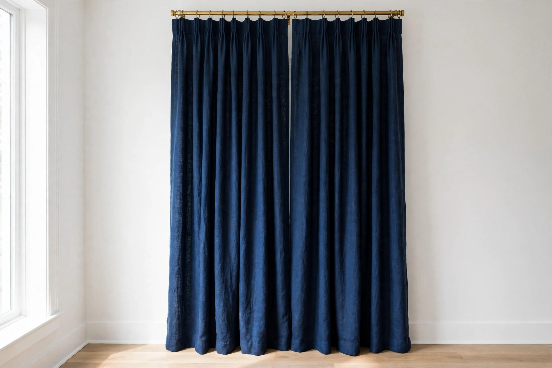
A dusty blue or a teal-edged blue suits cream, because both share a warm direction, while a cold navy against cream can look harsh. Cream walls also soften royal blue, which can otherwise dominate a room. If the room has cream walls and warm wood, lean toward dusty or light blue, and let the cream do the warming work.
Gray walls and blue curtains are a calm, modern pairing, but they need a depth step to avoid flatness. A navy curtain against a light gray wall gives contrast and structure, while a dusty blue curtain against a mid gray wall can blend into a single cool mass unless the depths differ clearly. The rule is the same as for any tone pairing: move the curtain at least one clear step lighter or darker than the wall, and let texture, such as a linen-look weave or a velvet pile, separate the two surfaces.
Blue curtains with sofas: navy, beige, and gray upholstery
The sofa is the second anchor in most living rooms, and the curtain should pair with it, not copy it. A navy sofa pairs best with a lighter blue curtain, such as dusty or light blue, because the lighter curtain frames the sofa instead of merging with it. A beige sofa pairs with almost any blue, and the choice becomes a mood decision: navy for formality, dusty blue for calm, light blue for airiness, royal blue for a bold accent. A gray sofa pairs best with a blue that differs in depth, such as navy against light gray or dusty blue against mid gray, so the two cool tones do not blend.
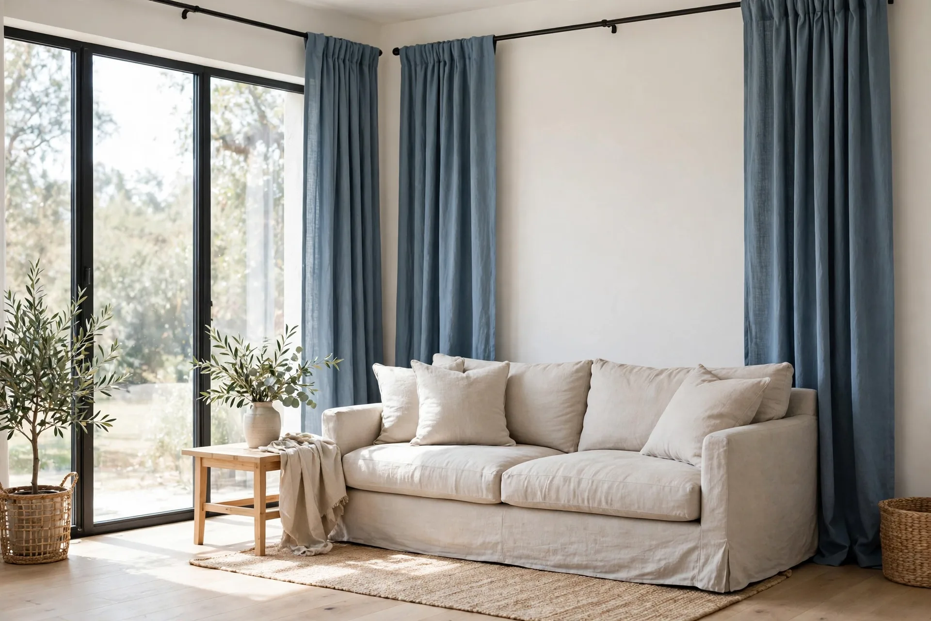
Pattern on the sofa changes the rule. A patterned sofa needs a solid blue curtain, because two patterns in one room compete. A solid sofa can carry a patterned blue curtain, such as a stripe or a subtle print, but the blue in the print should stay close to the sofa's tone family, so the room reads as one scheme. If the sofa is a strong color already, such as rust or mustard, a dusty blue curtain calms the room, while a royal blue curtain adds a second strong color and usually fights the sofa.
The other sofa consideration is light. A dark sofa in a dim room needs a lighter blue curtain to keep the room from feeling heavy, while a light sofa in a bright room can carry navy without trouble. The curtain and the sofa share the room's light budget, so when one is dark, the other should usually be light.
Blue light levels: sheer glow, room-darkening calm, and blackout sleep
Blue works at every light level, but the level must match the job, and the color alone never decides the darkness. A blue sheer gives a soft blue glow by day and daytime privacy only, and it fails at night when the lights are on. A blue light-filtering panel softens sun while keeping the room bright, and suits a living room that never needs darkness. A blue room-darkening panel cuts glare and most daylight, and suits a home office or a living room with a television. A blue blackout panel, with a blackout lining, gives the darkest result, and suits a bedroom or a media room.
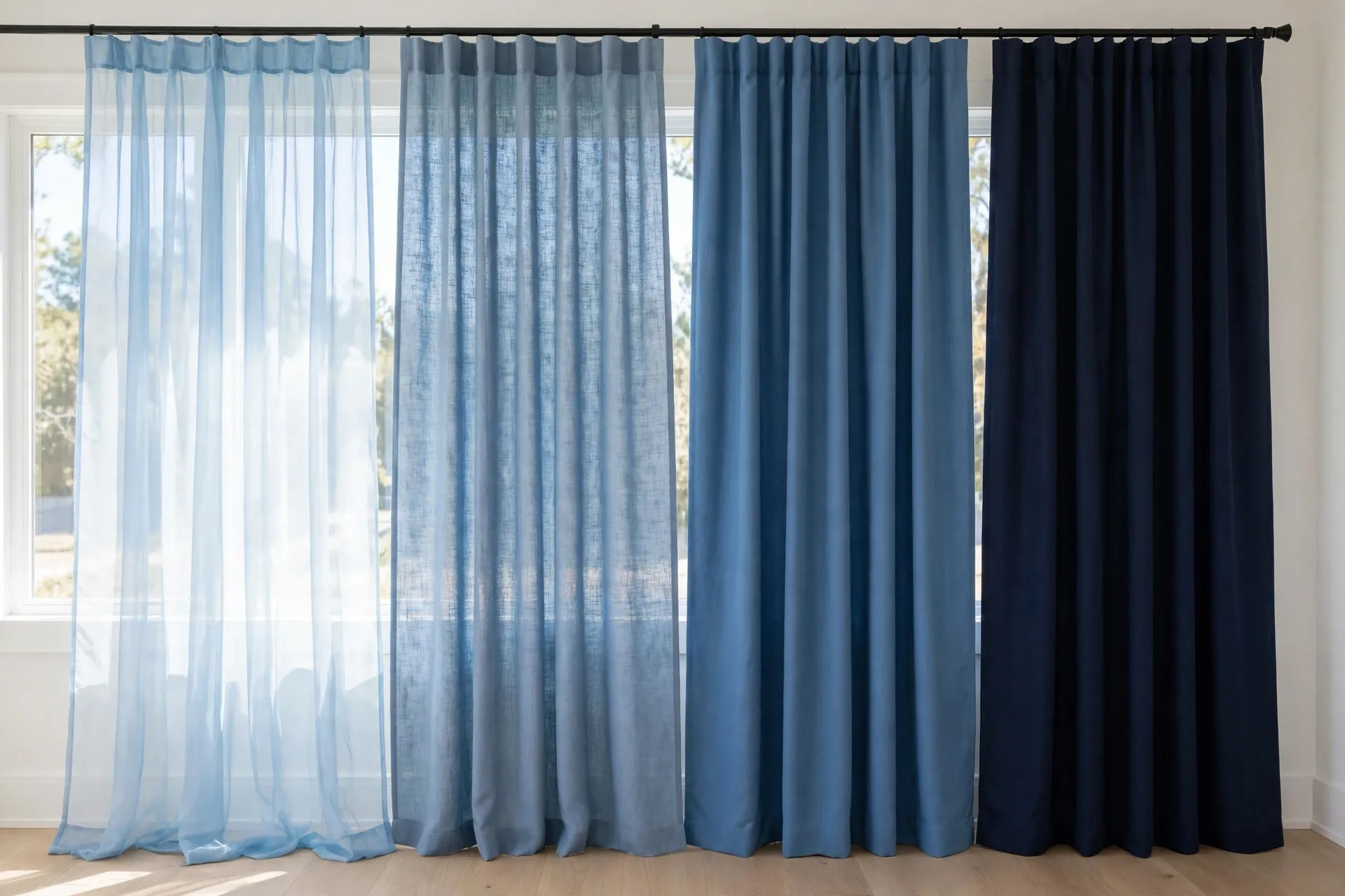
The trap is assuming a dark blue blocks more light than a light blue. It does not, on its own: a navy unlined panel can let in far more light than a sky blue panel with a blackout lining. The lining decides the darkness, and the shade decides the look. If you need darkness, check the listing for the lining and the light-blocking claim, and treat the shade as a separate choice. The best blackout curtains guide explains how lining types differ, and the best sheer curtains guide covers what sheers can and cannot do at night.
Layering solves the rooms that need two light levels. A light blue sheer behind a navy room-darkening panel gives a soft glow by day and glare control by evening, and the sheer keeps the room from feeling closed when the heavy panels are open. A sheer plus a blackout pair gives a bedroom both a bright morning and a dark night. Two layers cost more than one, but they are cheaper than replacing a single layer that does only half the job.
Blue in a bedroom: calm without cold
A bedroom is where blue's calm reputation comes from, and the shade decides whether the calm feels restful or cold. A navy blackout panel gives darkness for sleep and a formal, grounded feel, and it suits a bedroom with white or cream walls. A dusty blue panel gives a softer calm, and it suits a bedroom where the curtain should be felt rather than noticed. A sky blue blackout panel gives darkness with a light face, and it suits a child's room or a bedroom that must feel cheerful by day.
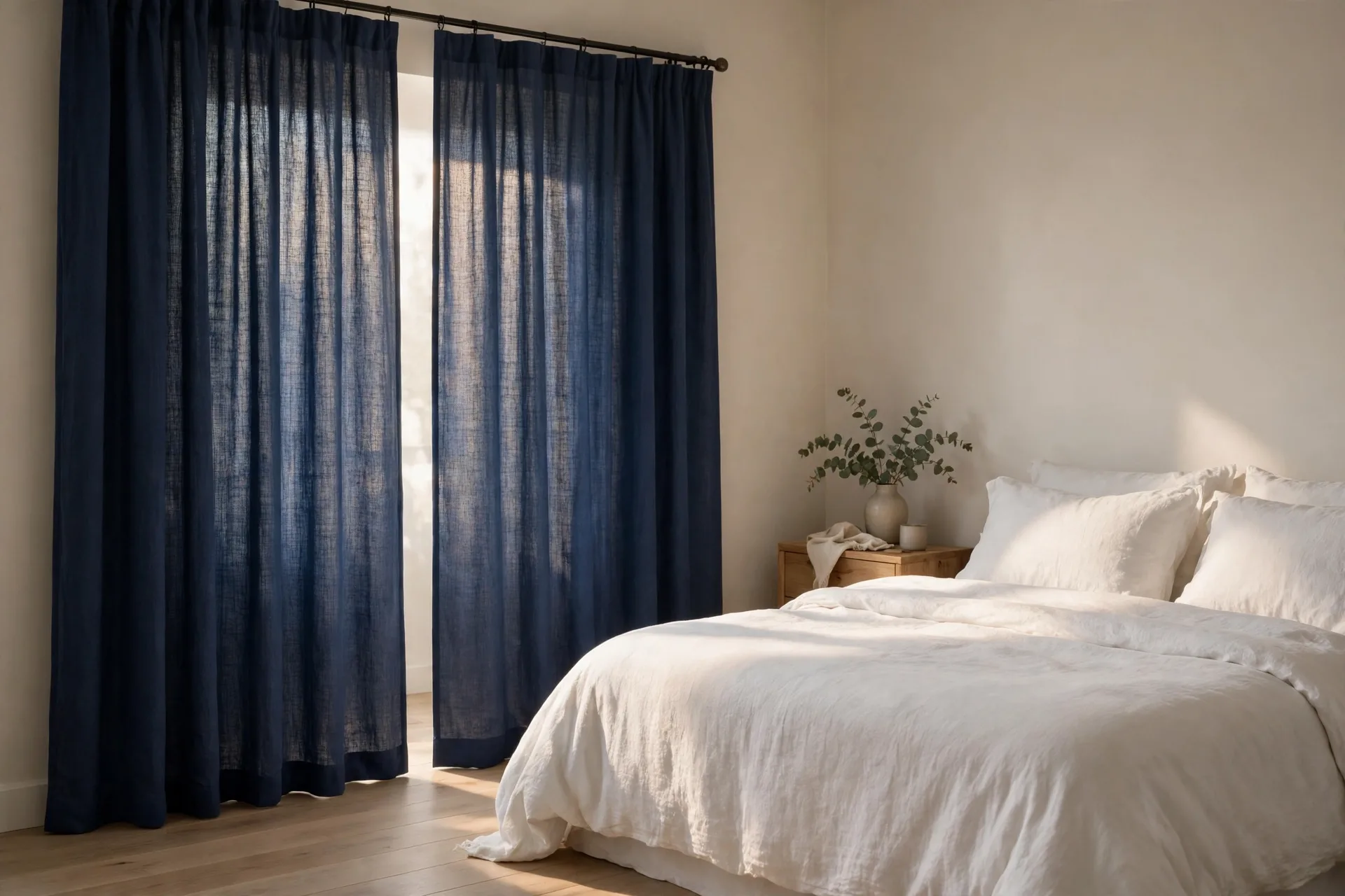
The cold risk is real, and it comes from pairing a cool blue with cool walls and cool bedding. A navy curtain, a gray wall, and white bedding can look crisp, but the same combination under cool daylight can feel icy. The fix is one warm element: warm wood furniture, brass hardware, cream bedding, or a warm rug. That single warm note keeps the blue calm from turning cold, and it costs far less than replacing the curtains. The best curtains for bedroom guide covers sleep darkness in more depth, and the same warming idea applies there.
Bedding color finishes the bedroom balance. White bedding beside any blue curtain looks crisp and intentional. Cream bedding warms a cool blue, and gray bedding suits a dusty blue. Avoid a blue bedspread in exactly the same shade as the curtain, because the room loses its edges and the bed blends into the window. Move the bedding at least one step lighter or darker than the curtain, and the room regains its shape.
Blue in a living room and home office: focus, glare, and video calls
A living room uses blue as structure and mood. A dusty blue linen-look panel gives a calm living room texture and color without dominating it, and it suits a gray or beige sofa. A navy velvet panel gives a formal living room depth, and it suits a room with dark wood and brass. A royal blue panel gives a neutral living room a bold accent, but it should stay on one window, not every window, or the accent becomes the whole room. The best curtains for living room guide covers how a living room's light changes the fabric choice, and the same thinking applies to blue.
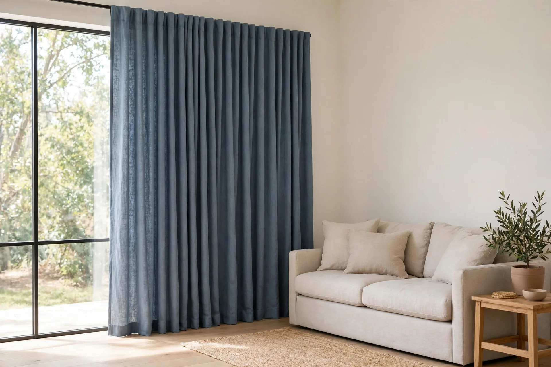
A home office uses blue as focus. A dusty or mid blue room-darkening panel cuts screen glare without darkening the room, and it keeps video calls looking neutral instead of tinted. Avoid a shiny blue fabric in an office, because shine reflects light unevenly and can glare on camera. A matte blue face is the safer choice for work, and dusty blue is the safest shade, because it reads as calm on camera rather than loud or cold.
The office mistake is buying a bedroom blackout panel for a room that needs only glare control. A blackout panel in a home office feels heavier than the room needs, and it costs more than a room-darkening panel that would do the job. Match the lining to the room's real job: blackout for sleep and viewing, room-darkening for glare, sheer for daylight accent. The color stays blue in all three, but the room feels completely different.
Blue fading in sun: keeping navy navy and sky sky
Blue fades in sun, and the fading shows differently by shade. Navy fades toward a duller, grayer blue, and the change is easy to miss until one panel looks lighter than the other. Light blue fades toward white, and the change shows as a loss of color rather than a shift. Royal blue fades fastest of the four in strong sun, because its saturated dye breaks down more visibly. A lining slows the fading for every shade, because the lining takes the brunt of the sun instead of the face fabric.
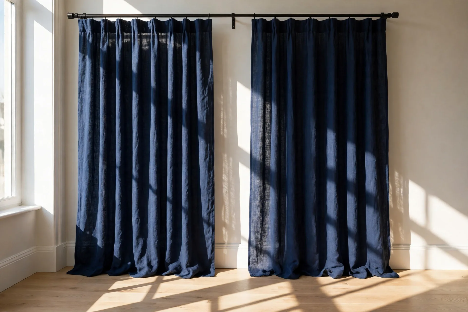
Prevention is the same for all blues. Rotate the panels now and then, so the same fold edge does not always face the sun. Add a sheer liner between the glass and the curtain in a strong-sun window, since the liner shields the face fabric. Wash only as the care label directs, and check the GINETEX care symbols on the label before the first wash, since the symbols, not habit, say whether the fabric can be machine washed, and at what temperature. Wash blue panels with like colors, because dye transfer in the wash dulls a blue faster than sun does.
When a fabric carries the OEKO-TEX STANDARD 100 label, it has been tested for harmful substances, which is a useful check for a bedroom curtain that hangs close to where you sleep. Treat the label as a safety check, not a quality grade: it does not say the fabric will not fade, and it says nothing about how the weave will wear, so look for it alongside the care label rather than in place of it.
Patterned blue: stripes, prints, and texture without noise
Patterned blue needs restraint, because blue already carries a lot of visual weight. A stripe is the safest blue pattern: it adds height to a room, it pairs with solid sofas, and it rarely fights the wall. A subtle geometric or tone-on-tone print suits a modern room, as long as the print's blue stays close to the room's blue family. A large, high-contrast print, such as a bold floral or a strong nautical motif, suits only a room that is otherwise plain, and it should stay on one window.
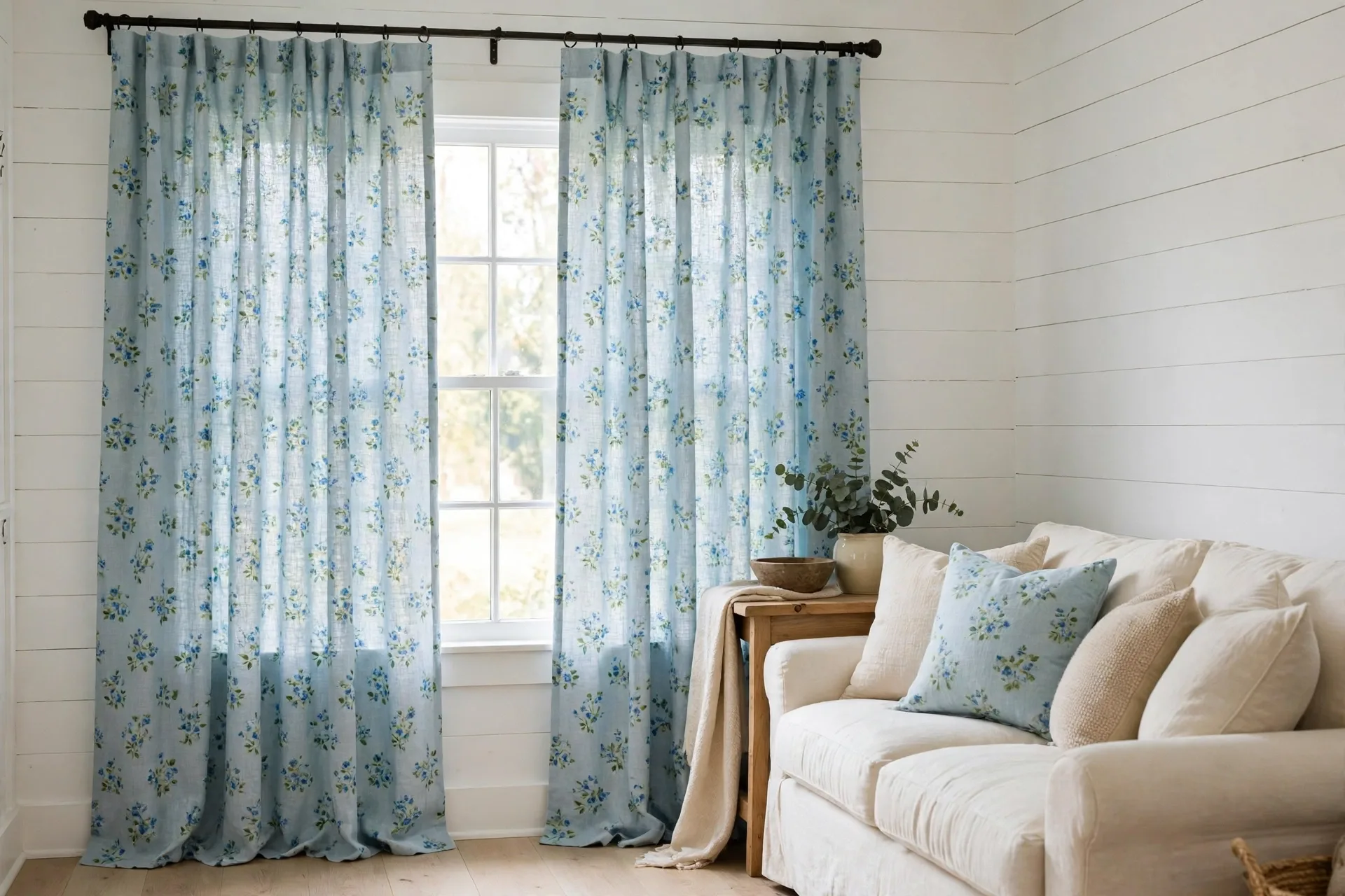
Texture is the quieter alternative to pattern, and it usually serves a blue room better. A linen-look weave, a velvet pile, or a subtle slub gives the eye detail at close range and calm at a distance, without adding a second story to the room. A blue sheer layer adds a second kind of texture: the soft diffusion of daylight itself, which makes a blue wall behind it look warmer and less stark. If the room already has a patterned sofa or a patterned rug, texture beats pattern for the curtain, because two patterns in one room compete.
The pattern rule for blue is one pattern per room at most, and the curtain should not be it unless the rest of the room is plain. A plain room can carry a patterned blue curtain beautifully. A busy room needs a solid blue curtain, and the texture does the interesting work instead.
Ombre is a quiet pattern option too: a sheer that fades from a light top to a dark bottom gives movement without a print, and suits a room where stripes or large prints would be too much.
Rods, fullness, and length for blue panels
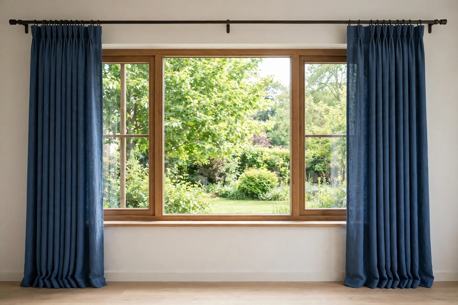
Hang blue wide and high, because a blue panel that stops at the frame edge can look small against the wall. Set the rod above the frame and extend it past the frame on each side, so open panels stack clear of the glass and closed panels cover the frame. Aim for total panel width of 1.5 to 2 times the rod width for a standard look, 2 to 2.5 times for a full look, 2.5 to 3 times for pinch pleat, and 2 to 2.5 times for sheer, so folds stay full when closed. Floor length is the default for a living room or bedroom, while sill length suits a small or utility window. A grommet heading slides freely for daily use, while a rod-pocket heading suits a panel that mostly stays in place.
Blue mistakes that make a room look cold or flat
The most common blue mistake is pairing a cool blue with cool walls, cool bedding, and cool light, and ending up with a room that feels icy. The fix is one warm element, not a new curtain: warm wood, brass hardware, cream bedding, or a warm rug. The second mistake is matching the curtain exactly to a blue wall or a blue sofa, which flattens the room. Move the curtain at least one step lighter or darker, and the room regains its edges. The third is buying navy for a small or dim room, where it absorbs the light the room cannot spare.
The fourth mistake is judging darkness by shade alone, and buying an unlined navy panel for a bedroom that needed a lining, or a blackout sky blue panel for a living room that needed only daylight. Match the lining to the job first, then pick the shade. The fifth is buying blue by the photo alone, because blue shifts more than most colors between screen, shop light, and home light. A sample in your own room, checked morning and evening, prevents the most common blue regret.
A last blue mistake is leaving the window bare at the sides. Blue panels that just cover the glass look cramped, while panels hung a little wider than the frame and a little higher than the top give the window presence. The how to hang curtains guide covers rod placement, and the how to measure for curtains guide covers the widths to order, so the panels you buy actually fill the space they are hung in.
Frequently asked questions about blue curtains
The questions people ask most about blue curtains cover shade, pairing, and fading, with the detail in the guide above.
What color curtains go with blue walls?
White is the safest choice with blue walls, because it brightens the room without competing. Cream warms a cool blue wall, gray gives a calm monochrome look, and a blue curtain one clear step lighter or darker than the wall gives a layered tone-on-tone pairing. Avoid an exact blue match, which looks flat.
Do navy curtains make a room look smaller?
Yes, they can, especially in a small, dim, or low-ceiling room, because navy absorbs light. Hang the panels wide and high so the fabric stacks clear of the glass, keep the walls and ceiling light, and add a sheer layer for daytime light. A small or dim room usually looks better with dusty or light blue.
Are blue curtains good for a bedroom?
Yes, blue is one of the best bedroom colors, because it reads as calm. A navy or sky blue blackout panel gives darkness for sleep, while a dusty blue panel gives a softer calm for a room that does not need full darkness. Add one warm element, such as cream bedding or warm wood, so the calm does not turn cold.
Do light blue curtains block light?
Only with the right lining. A light blue unlined panel lets in plenty of light, while a light blue panel with a blackout lining blocks it. The shade decides the look, and the lining decides the darkness, so check the listing for the lining and the light-blocking claim rather than judging by the color.
What sofa color goes with blue curtains?
A navy curtain pairs with a beige or light gray sofa, a dusty blue curtain pairs with a gray or beige sofa, and a light blue curtain pairs with a white or cream sofa. A navy sofa pairs best with a lighter blue curtain, so the two do not merge. A patterned sofa needs a solid blue curtain, because two patterns in one room compete.
Will blue curtains fade in sunlight?
Yes, slowly, and royal blue fades fastest in strong sun. A lining slows the fading, a sheer liner adds a shield, and rotating the panels now and then spreads the exposure. Wash blue panels with like colors, since dye transfer in the wash dulls a blue faster than sun does.
Are blue curtains good for a home office?
Yes, especially a dusty or mid blue room-darkening panel, which cuts screen glare without darkening the room. Choose a matte face rather than a shiny one, since shine can glare on video calls. Dusty blue reads as calm on camera, which is a practical advantage for work calls.
Do blue sheer curtains give privacy at night?
No. A blue sheer gives daytime privacy from outside, but interior light makes it see-through from outside at night. A blue sheer is a daylight layer and a daytime privacy layer, not an evening privacy solution. Layer it with a heavier panel for night privacy.
What is the difference between navy and royal blue curtains?
Navy is a deep, dark blue, close to black in dim light, and it reads as formal and grounding. Royal blue is a brighter, more saturated blue, and it reads as bold and energetic. Navy suits a bedroom or a formal room, while royal blue suits a single accent window in a neutral room. Royal blue also fades faster in strong sun, so it needs a lining or a sheer liner on a sunny window.
This guide is research-based curation: we compared maker specifications, published reviews, and current prices. Read how we choose.